Oxfam: Inequality Campaign Identity
Oxfam Australia wanted to reach young Australians who were angry about inequality and looking for a way to act on it. The campaign had a name that expressed that frustration in two words. My brief was to give it a visual identity that people could make their own.
- Client
- Oxfam Australia
- Deliverables
- Campaign IdentityMerchandise DesignAdvocacy Design
- Year
- 2024
- Role
- Brand & Visual Identity Design
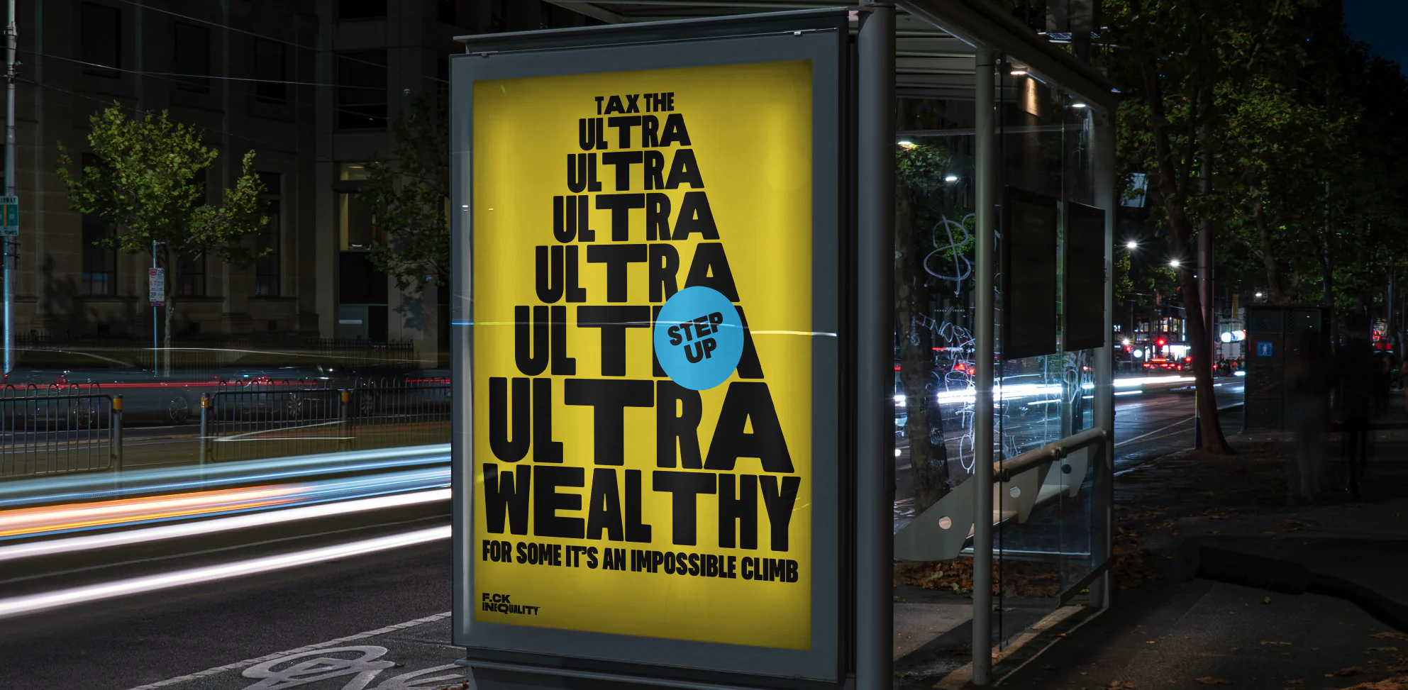
I designed the identity from the ground up. I approached it from the perspective of someone choosing to wear the message. On a piece of merchandise, the name becomes a personal statement.
In advocacy, that same identity has to bring people together around a shared cause. That shaped how I designed the brand across both settings, keeping the directness of the name and giving supporters a recognisable way to express where they stood.
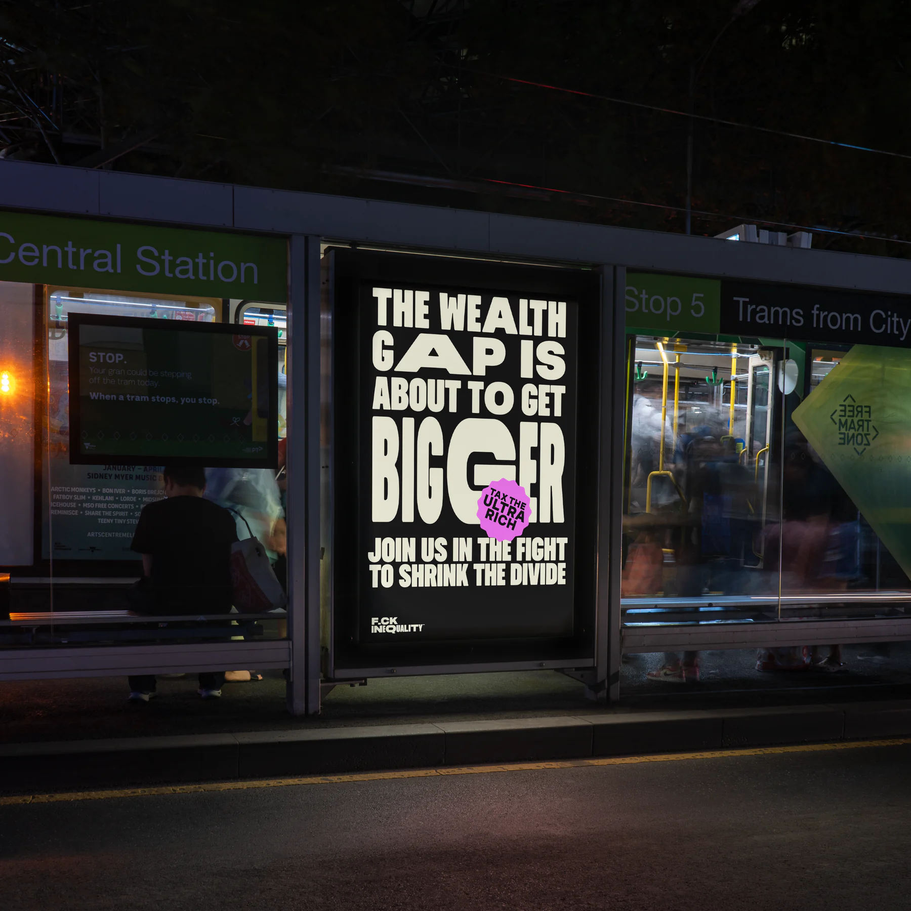
Oxfam’s initial research with young Australians found strong engagement and positive feedback on the brand. What stood out was the desire for community. Students wanted to find others who shared their frustration and take action together. For Oxfam, that gave the identity a role beyond attracting attention: it could help young supporters recognise one another and organise around an issue they already cared about.